Jennifer - yeah, we’ll see. The Georgia DPH has become somewhat of a joke due to obviously intentionally misleading things, but that’s where most of the data still comes from.
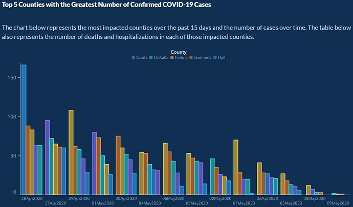
There’s one example - it’s not all that easy to see, but check out the dates. 
It’s gotten to the point that state legislators and scientists are asking, in effect, “What are you idiots doing?” One or two mistakes would be one thing, but there’s a large pattern of trying to be misleading.
The “cases over time” graphs, with the last 14 days being incomplete, make the more-recent numbers look like they’re always falling off a cliff. The DPH changed to this way of presenting the numbers in April, right before the announcement was made that some restrictions would be lifted. Many an eye was rolled.
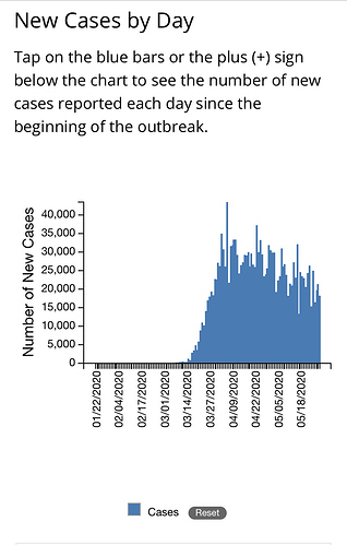
That period from May 11 to May 19 - it does look like something is going on, and you may be right about a new uptrend. Georgia data is pretty dodgy, in my opinion, anyway - there are 159 counties in the state, with the largest 4 having ~3.5 million people. Then there are also 33 with <10,000 each. Some of these county ‘health departments’ are just one nurse manager, with reporting, hospitals, medical examiners, coroners, etc., being in other counties and accessed through larger ‘public health districts’ - there are 18 in the state. I don’t know if there is deliberate under-counting of deaths or cases, other than the DPH including antibody tests in the total tests number but not including positive antibody tests in the total positive tests number (which is yet another unbelievably stupid thing).
In the beginning of the virus outbreak, data on deaths and testing was very delayed from some areas. At the end of the year I’d like to see total death numbers for the entire state, to see how it compares to normal, expected morality.

