New Color palette


(Richard Morris) #1

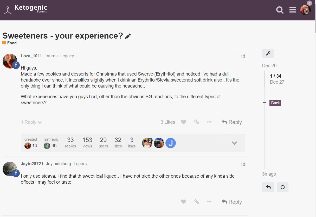
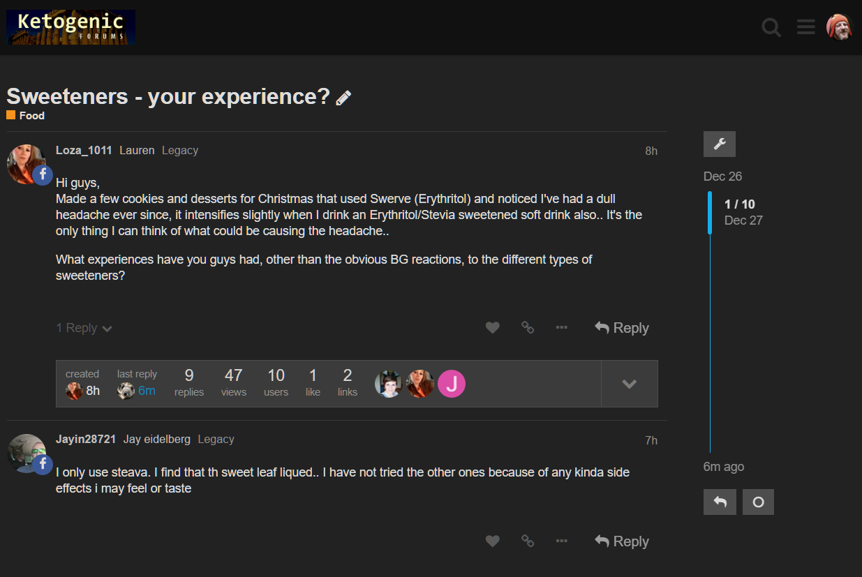
We have changed the “theme” from dark to light. Tell us what you think!

  • I prefer the light (FaceBook) theme.
  • I prefer the dark theme.
  • I could care less. Pass the bacon

0 voters

A reminder of what they look like
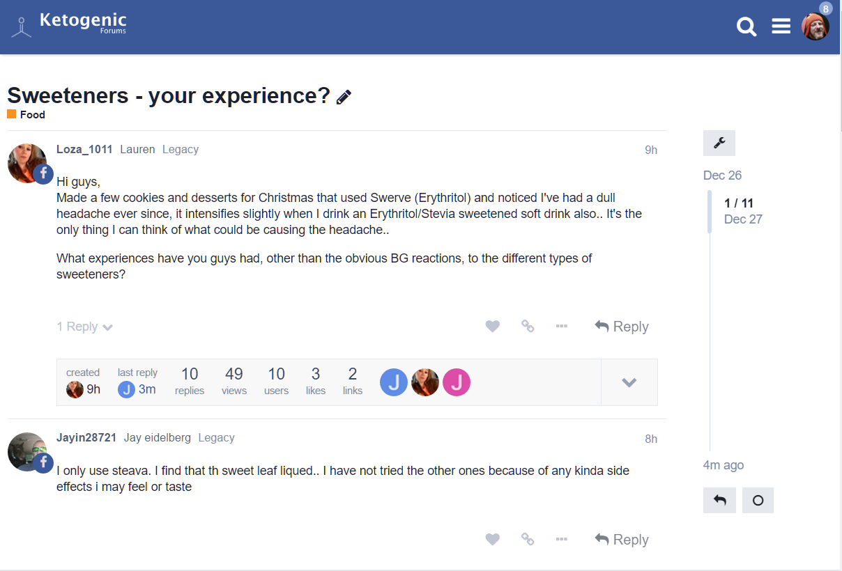
##NEW
I just added a new less harsh less facebook looking palette


New palette poll
HOW TO: Use a DARK color theme
(Kim parker) #2

I like the dark theme b/c it’s easier on the eyes while reading in bed, LOL


(Mark Anthony Spiteri) #3

The dark theme was easier on the eyes, especially at night! But the light theme is very clean and ‘modern’! Maybe we need a "night mode’ :slight_smile:


(Richard Morris) #4

We need it to integrate with f.lux and remove all blue light as the sun goes down :slight_smile:


(carl) #5

I agree. I like dark, but I will bow to the majority.


(Vesa McD) #6

Isn’t it possible to have it user selected?


(carl) #7

OK. I found a really good solution. Install a browser plugin called Stylish, and there’s a dark theme you can apply to ketogenicforums.com

Once you install Stylish, use the stylish plugin to Manage Styles, then change the domain to “ketogenicforums.com”, hit the Add button, and poof! Everything looks dark again


(Mark Anthony Spiteri) #8

Agree! f.lux just started kicking in right at this moment and it is already easier on the eyes :wink:


(Retta Stephenson) #9

In design, we (artists) are taught that it’s the contrast that affects whether or not something is hard on the eyes or not.

On the design side, I find the black background “prettier”, making the color notes sparkle. BUT, practically speaking, I definitely find the lighter background easier on my eyes, especially since I find I do a lot more reading here than at the FB site.

Some forums have the capability of allowing the user to choose their background interface. Maybe that might someday be an option?


(Mark Anthony Spiteri) #11

Just thinking out loud here - but what might work (and if Discourse allows you too) is if the background is not white as well. So you have a contrast between the background and the posts. Basically something like Facebook where the overall background is grey and the posts are in a white background.


(carl) #12

Refresh the page and read my comment about Stylish


(Mediterranean Magic! Show me yer...) #13

Timed to your time zone!


#14

Is there a medium option? Lol


(jketoscribe) #15

I loved the black background on my mobile device, but it was pretty illegible on my computer screen (though I think it has convinced me to get a new monitor!).


(Larry Lustig) #16

If you could just combine the black background from the first theme with the black text from the new one then I’m sure everyone would be happy.


(G. Andrew Duthie) #17

I voted “pass the bacon” but in reality, I’d love for this to be a user setting. There are times and places where reading light text on dark background is much easier on the eyes.

From a purely aesthetic standpoint, I find the light theme more appealing.


(Jessica K) #18

I think the white is cleaner and easier to read. The black theme looked fine on my iPad but was harder to read on my computer. Stylish is a great tool for people who want the dark back :smiley:


(Lauren) #19

I like both, don’t use the PC much so it’s iPad use for me… The blue/white does remind me of Facebook though :smirk:


(Tom) #20

I agree with the user selection idea. On mobile, dark is my preferred choice, but on my laptop light would be easier.


(Becky Searls) #21

Is there a way to make it changeable on a user-level? Like iBooks or kindle app?