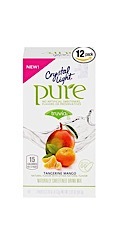
I wear pretty powerful glasses these days, and I can read well-designed labels, but some are simply badly designed, and much less legible than they ought to be.
I don’t know what the regulation situation is in the USA, but as you probably know, the EU is highly regulated (and the UK was, even before the EU, and will probably remain so).
So there are strict standards about the content of labels, but I suspect not very much about label legibility. I have long thought that there should be regulation about point size of type, and background colour (default being black print on white background as far as I’m concerned).
(and point size should generally be quite a bit bigger than it tends to be now).
There may need to be exceptions for labels on small containers, but they would need to be just that: exceptional.
Photo idea is a good one though (although I know that some stores would get funny about that…).