
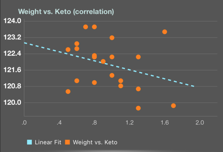
I was curious about the correlation between weight and ketone level. So, I wrote an app that keep track of ketone level and weight. The graph suggests that higher keto values correspond to lower weight. Of course, this is not a scientific study and is more an anecdote. If you happen to use the app (Keto Plot in the app store) please share your graph.
Correlation between weight and Ketone
PrimalBrian
#2
How so? I looked at this graph for a couple of minutes and don’t see the relationship. Can you help me understand the data points?
MeanRaw_RawMean
(Mean Raw Raw Mean)
#3
The vertical axis is weight and the horizontal axis is Keto level. Each orange dot represents one (weight, keto) datapoint. Both weight and keto fluctuate on a daily basis, so in data science, a line is fitted (using the least squares method) to better reveal the trend. In this case you can see that higher keto values correspond to lower weight and that’s why the blue line has a negative slope.
PrimalBrian
#4
Ah I see. Thanks for the explanation. I think I understand now. I wonder if the weight is fat loss weight or water weight. Im not sure to what extent high ketone levels might contribute to dehydration and therefore lower weight at that point in time. Unsure on that.
MeanRaw_RawMean
(Mean Raw Raw Mean)
#5
Good point. Based on physical observation, I suspect the weight loss is due to fat loss and not dehydration.
ava_ad0re
(Katie the Quiche Scoffing Stick Ninja )
#6
I don’t understand the point of this as our ketone levels change rapidly throughout the day, so how can you ever have a correct reading? I don’t get it.
Nevermind I just read above. Interesting.
MeanRaw_RawMean
(Mean Raw Raw Mean)
#7
Right, that’s exactly why the blue lines is computed by the app and plotted together with raw data: the raw data fluctuates a lot due to the measurements being noisy. Th blue line computes the trend (technical term is least squares fitting) and avoids the noise.